
In conversation with: Samuel Lim on redesigning Singapore’s subway signage

I was taken on a tour of Singapore’s mass rapid transit system in early March to see its new signage system. As lead designer Samuel Lim guided me through a station, he stopped dead in his tracks. “Oh dear!” he said, “Here come the paper signs…”
A portable stand was holding up one A4-size sheet reading: “North South Line.” This makeshift sign sat right under an official sign displaying the very same information, hanging above from the ceiling. It not only duplicated Lim’s redesigned sign, but indicated a problem in his system that was rolled out in January this year.
“It means that our redesign, in this instance, has failed, because people can’t even see the signage hanging up there above,” said Lim, who works at the Land Transport Authority (LTA), a government agency that oversees the signage system of Singapore’s Mass Rapid Transit (MRT) system. Although the state provides and installs the signage in all train stations, the MRT system’s various train lines are run by different private train operators that have supplemented the official communication with their own paper signs. Over the years, in response to commuters’ frequently asked questions and confusion with the signage, enterprising operators have tried to address the issue with their own signs.

Makeshift paper signs such as these are typical across Singapore’s MRT system.
The clutter of paper signs is one of many reasons why Lim initially embarked on redesigning the signage system in 2015. The then BA(Hons) Design Communication student at LASALLE College of the Arts saw paper signs as not just confusing, but literally paper over the cracks of a broken system. For his graduation project, Lim proposed a simplified signage system, which he eventually posted online. It somehow found its way to LTA, and he was invited for a “chat,” which turned out to be a job interview.
“It is funny thinking back, because they are now my bosses,” said Lim. “I just thought they were interested in my project and wanted to bring back my findings to their team.”
It marked the beginning of a four-year journey. But even before Lim could get down to redesigning, his first task was convincing his new colleagues—all older than the then 25-year-old—of the need to overhaul the over-a-decade-old system. The previous signage, designed by a team led by international branding consultant Citigate Lloyd Northover, was first unveiled to the public around the 2000s, when Singapore only had three train lines. The numbers doubled by the 2010s, growing into a dense network with multiple interchanges that was challenging for commuters to navigate.
At another station still installed with the previous system, Lim pointed to directional signs that have multiple lines of words crammed with the names of nearby landmarks, pictograms, direction arrows, and exit codes. Such long directional signs take time to be read, and look unnecessarily complex, he said. A common sight at stations was of lost commuters staring upwards at a sign. According to Lim, independent eye-tracking studies also confirmed that the signs were overloaded, and no amount of tweaking the existing design solved the problem.

In contrast, the new system emphasizes a hierarchy in signage, a concept that was at the heart of Lim’s proposal. Inspired by economist Richard Thaler’s 2008 book Nudge, Lim sought to reduce the number of choices presented to commuters. Directional signage was simplified: It now only displays pictograms, cleaning up the clutter of words previously found across all stations.

The new information point is installed at prominent spots across the station and exit signs now come in numbers.
“The new system prompts people to ask the right questions and think about whether they can answer the questions themselves,” said Lim, who was assisted by designer Muhd Ridzwan Abdollrasid in crafting the new system.
Lost commuters can consult information points prominently installed around the station to identify the correct numbered exit to take. These exit codes are displayed as rectilinear black-and-yellow symbols on directional signs, and are also found near each exit.
Lim described the process as, “Inform, direct, and confirm.” He came up with this jingle after tests of his early prototypes received feedback that they were not “intuitive.”
“‘Intuitive’ should mean a design that is easy to pick up and interact with, rather than something one immediately knows,” he said. “I’m sure it took us many years to recognize the symbol of a man and a woman as the toilet sign.”
While the new system retained the conceptual framework of Lim’s final-year project, he had to work with the previous design and also incorporate new considerations, particularly for Singapore’s aging population. His redesign has bigger signs, a black-and-yellow scheme for better contrast, and uses a more readable typeface, Stroudley, which type designer Dalton Maag originally created for Hong Kong’s railway system. New pictograms were also introduced: exit codes now come in numbers instead of alphabets as they are more universally understood; and there is a clearer distinction between the toilets and the lift.

“It was very important for the elderly because they would literally rush to the lift thinking it was a toilet,” said Lim. Such a confusion only surfaced after the signage team shadowed elderly commuters as part of a study.

The previous pictogram (left) compared against the redesigned pictogram (right).
Another new addition dear to Lim is the escalator pictogram. While traveling for his internship elsewhere years ago, he often encountered commuters at a train interchange going up an escalator only to come straight down again. They wanted to switch train lines, but were confused by a sign above the escalator that had an up arrow next to the name of the train line.
“I took a photo and started to think about whether I could fix the sign’s design. When I started to dig deeper, I realized it was a system-wide issue. So that’s when it became my thesis,” said Lim.
Accompanying the new signage is also a redesigned system map. In 2015, Lim started redrawing it after LTA began constructing the final stage of Singapore’s Circle Line, which would finally make it a seamless loop. He made this line a focal point of the new map, inspired by how Moscow’s metro map also uses a circular line to hold together the cluttered collection of train lines. To his surprise, Lim later learnt that his redesign also met the function of the Circle Line, which had been created to connect all of Singapore’s train lines. Studies conducted found that his new map nudged commuters to plan their route using the line even though it meant traveling an extra station or two.
Before LTA finally decided to unveil the new map and signage system in December 2019, two individuals separately proposed redesigns online. They also used the Circle Line as a focal point, which led some members of the public to question if LTA had copied the designs. Both the agency and the two designers reject this idea, but it reminded Lim of how challenging it can be working in a large bureaucracy where change takes time to happen.
“As an impatient new designer, I want to see my work out there,” he said. “Along the way, there were ups and downs, but it’s all part of the process.”
Although the new signage and system map is finally launched, Lim knows the work has just begun. It’s currently installed only across Singapore’s newest train line, the Thomson-East Coast Line, and will eventually be rolled out across the older lines. That new, make-shift “paper signs” have emerged even after his redesign prove that there are still kinks to be smoothed out.

Part of the reason is also beyond just the signs. Working in LTA over the years has helped Lim understand that signage is just one of many tools for wayfinding. He and his signage team are also consulting more on the architecture of future stations, working with the agency’s public art team on using art as landmarks, and educating private train operators on the importance of not cluttering the station.
“I will only succeed if I can hear what I would have said come out from someone else in my team,” he says. “It turns out I’m not a designer. I’m more like a mindset changer.”
Story reproduced and courtesy of AIGA Eye on Design. Access the original here.
Related stories
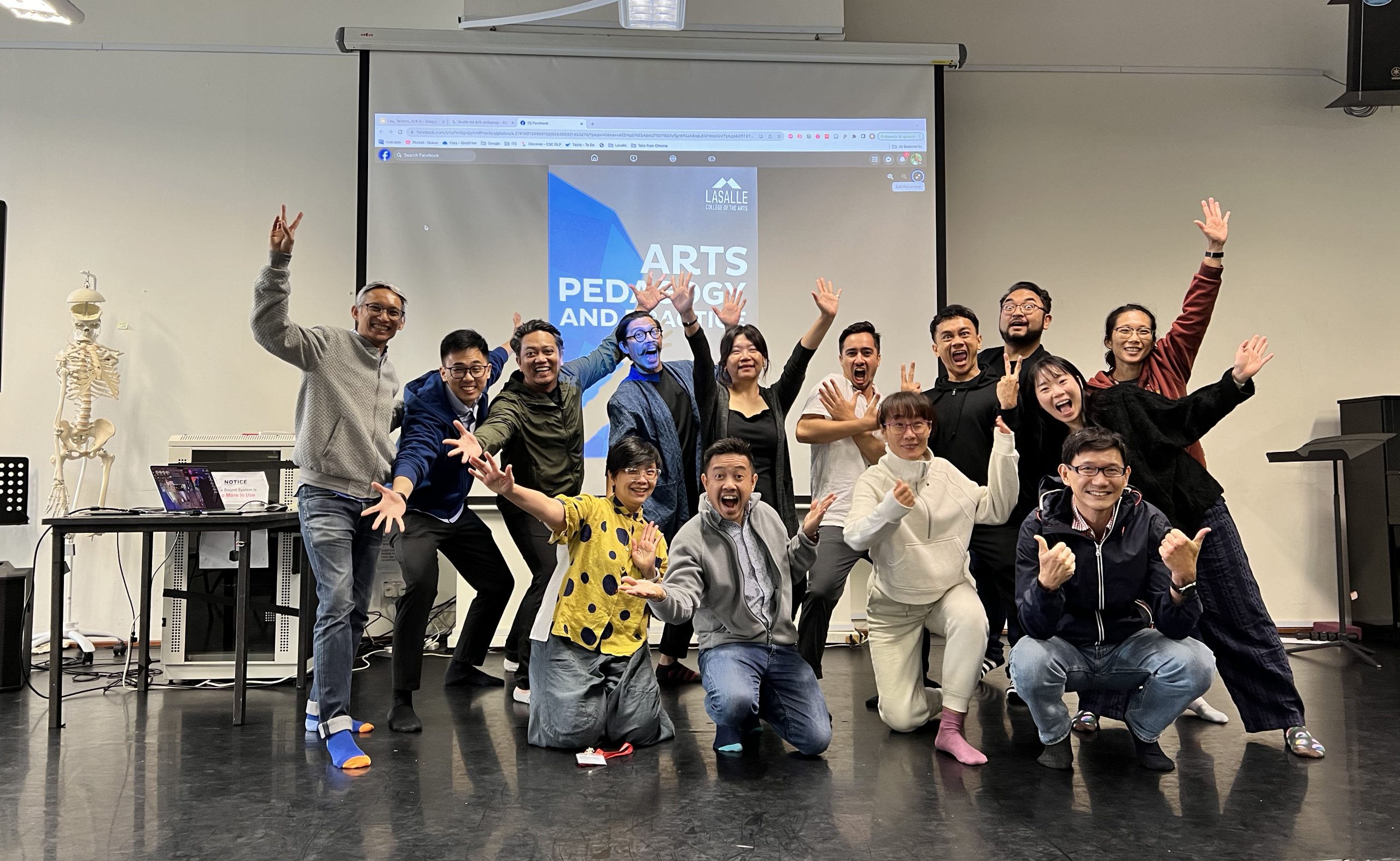
What happens after an MA: MA Arts Pedagogy and Practice alumni Yazid Jalil and Rafi Dean
LASALLE’s MA Arts Pedagogy and Practice programme typically brings together practitioners and educators from a wide range of backgrounds. With unique opportunities for cross-pollination across disciplines, as well as an …
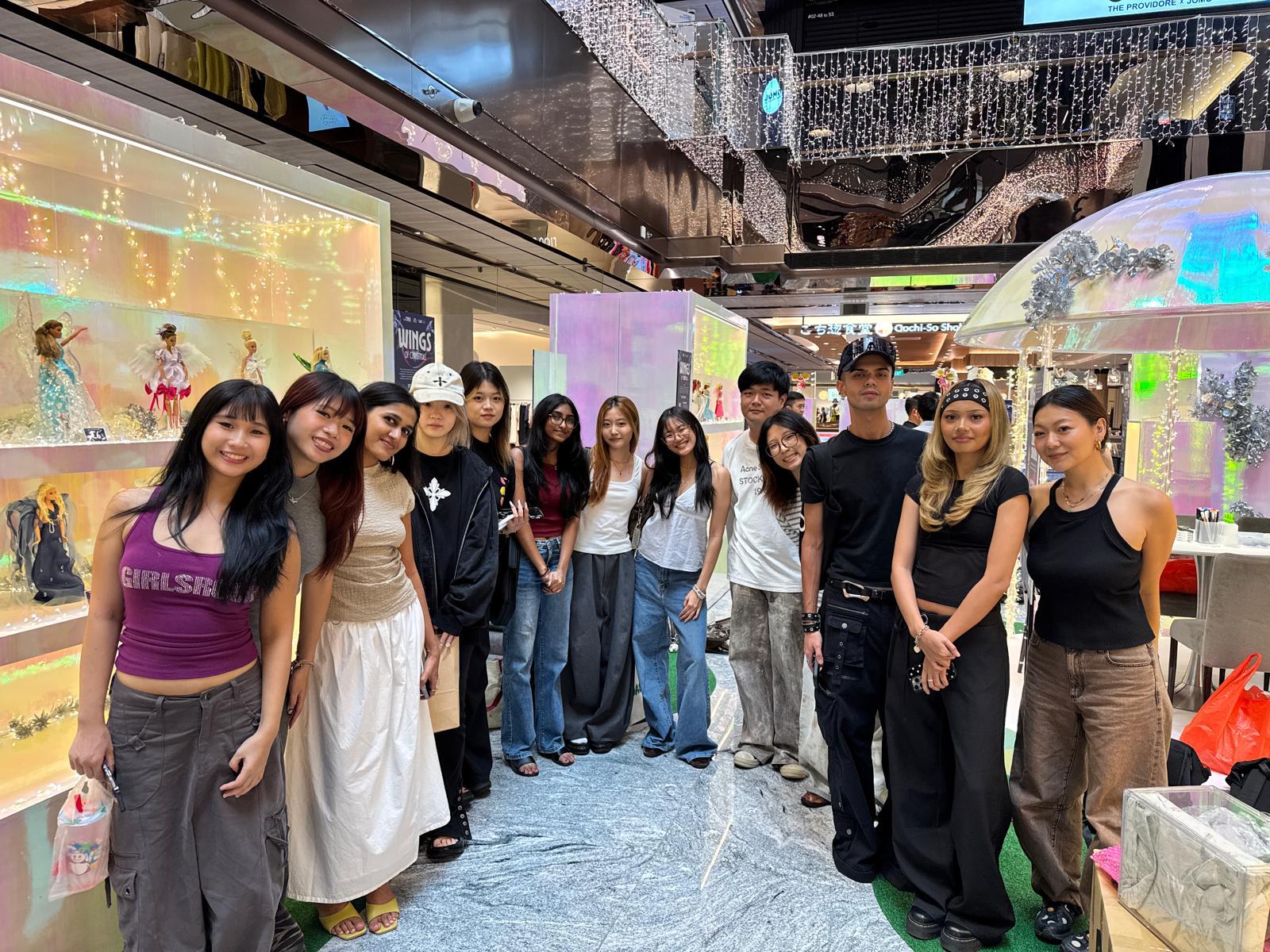
Fashion takes flight at Wisma Atria with LASALLE’s School of Fashion and Mattel Singapore
30 Barbies collaboratively attired by 30 students from the BA (Hons) Fashion Design and Textiles and BA (Hons) Fashion Media and Industries programmes are currently on display at the indoor …
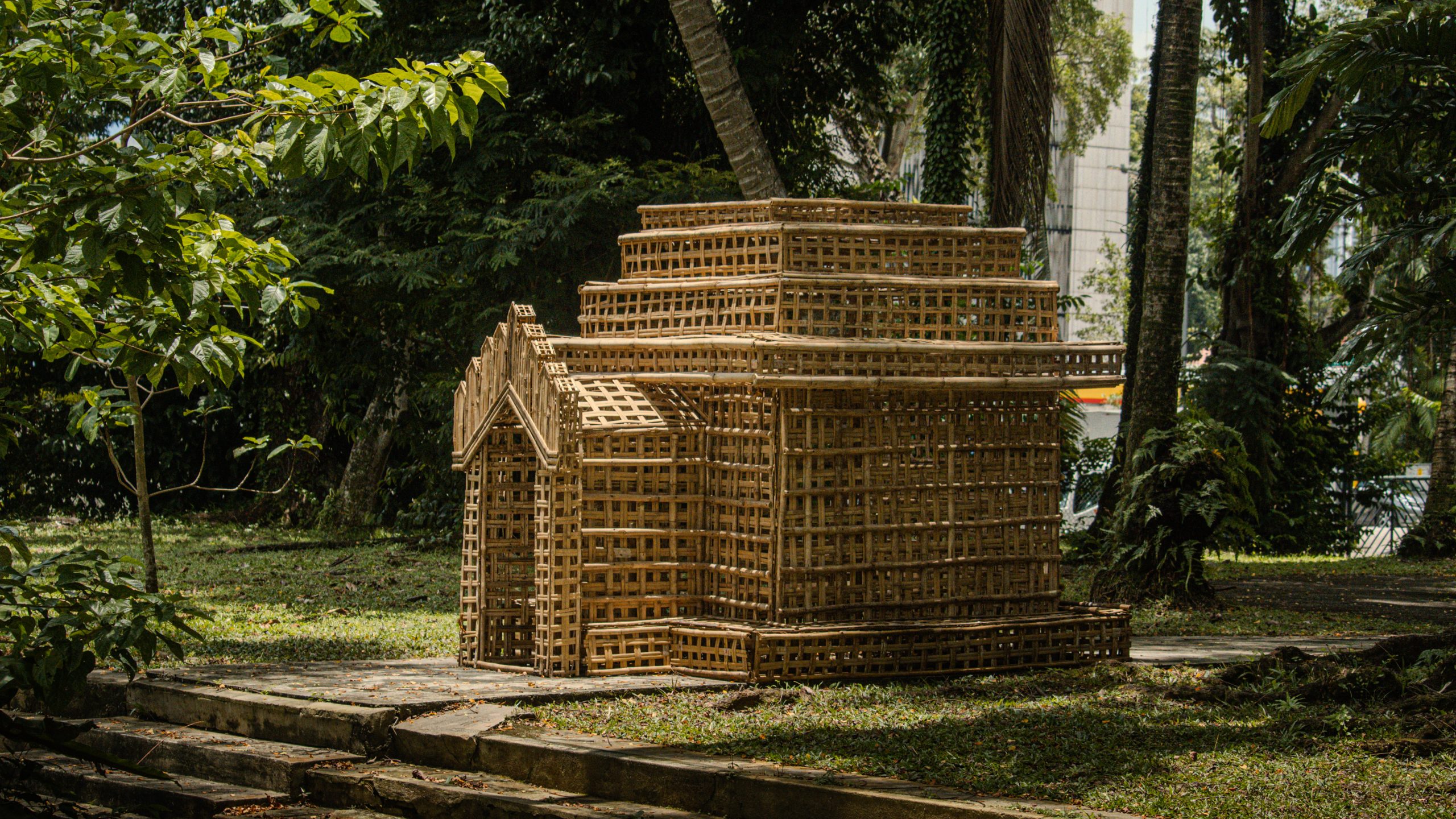
In the studio with: MA Fine Arts’ Nanaki Singh and Lim E-Lynn Joanne
The artist’s studio is a space for individual experimentation and creation, but for Class of 2025 MA Fine Arts’ graduates Nanaki Singh and Lim E-Lynn Joanne, their studios were not …
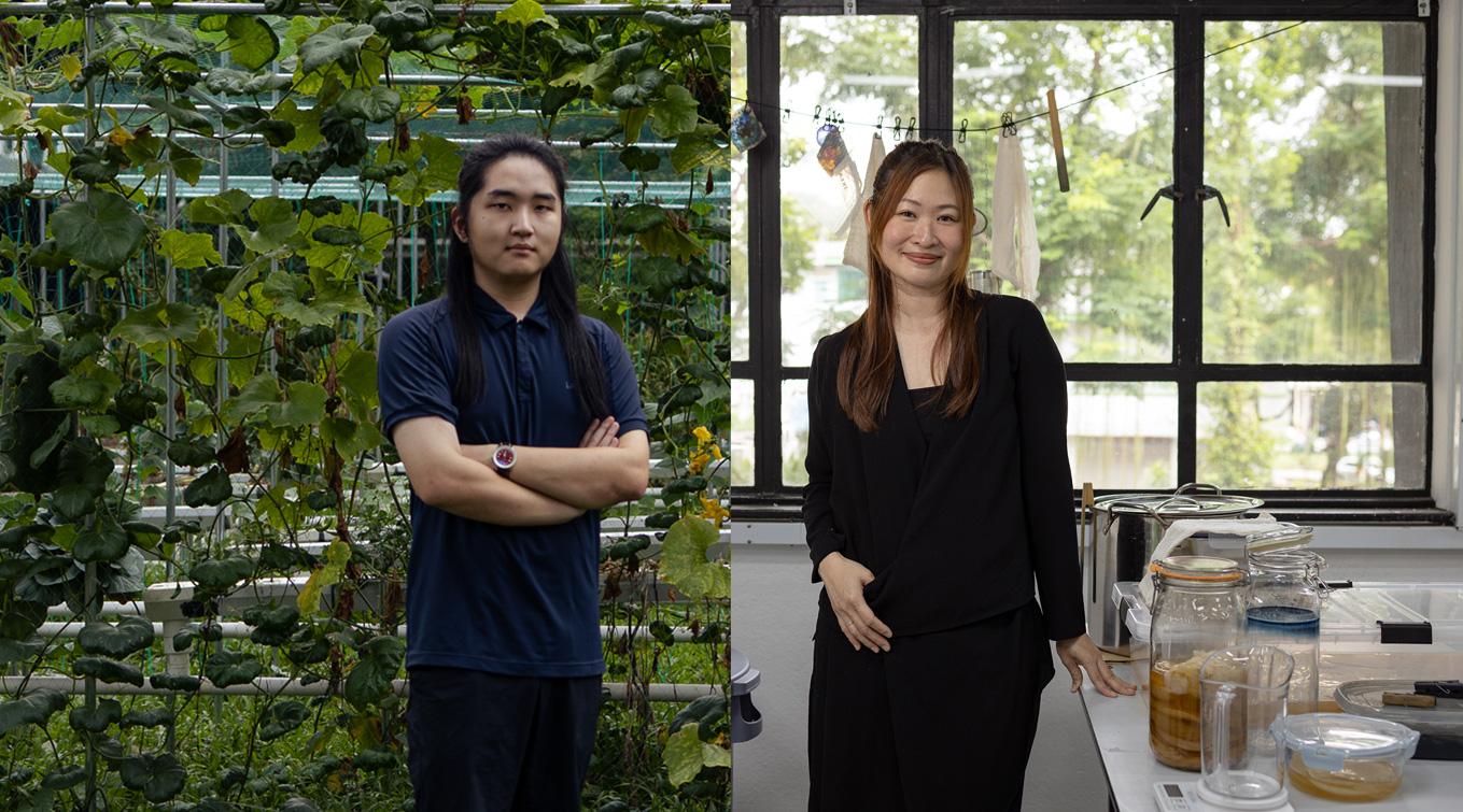
In the studio with: MA Arts and Ecology’s Charles He and Pauline Lim
The MA Arts and Ecology programme, one of LASALLE’s latest MA offerings, is a unique transdisciplinary programme for creative practitioners who seek to explore critical environmental discourses, address questions around ecological crisis …