Winner
(Brand Identity)
Joshua Yeo
Diploma in Design Communication, Class of 2018
Entry: Nest Hotel
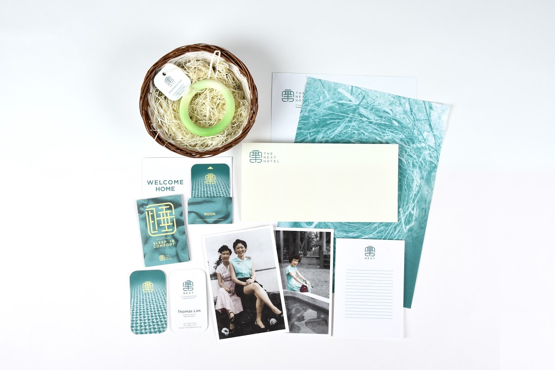
The visual identity reflects the architecture of Tiong Bahru – a quaint neighbourhood in Singapore marked by streamlined modernism and a touch of Chinese tradition. The brand colours are inspired by green jade and gold jewellery. The hotel’s logo displays the Chinese pictogram of the word “nest” in a dynamic manner, conveying a sense of tradition while, at the same time, promising modern comfort.
Winner
(Magazine)
Jessie Tan
Diploma in Design Communication, Class of 2018
Entry: Brut Magazine
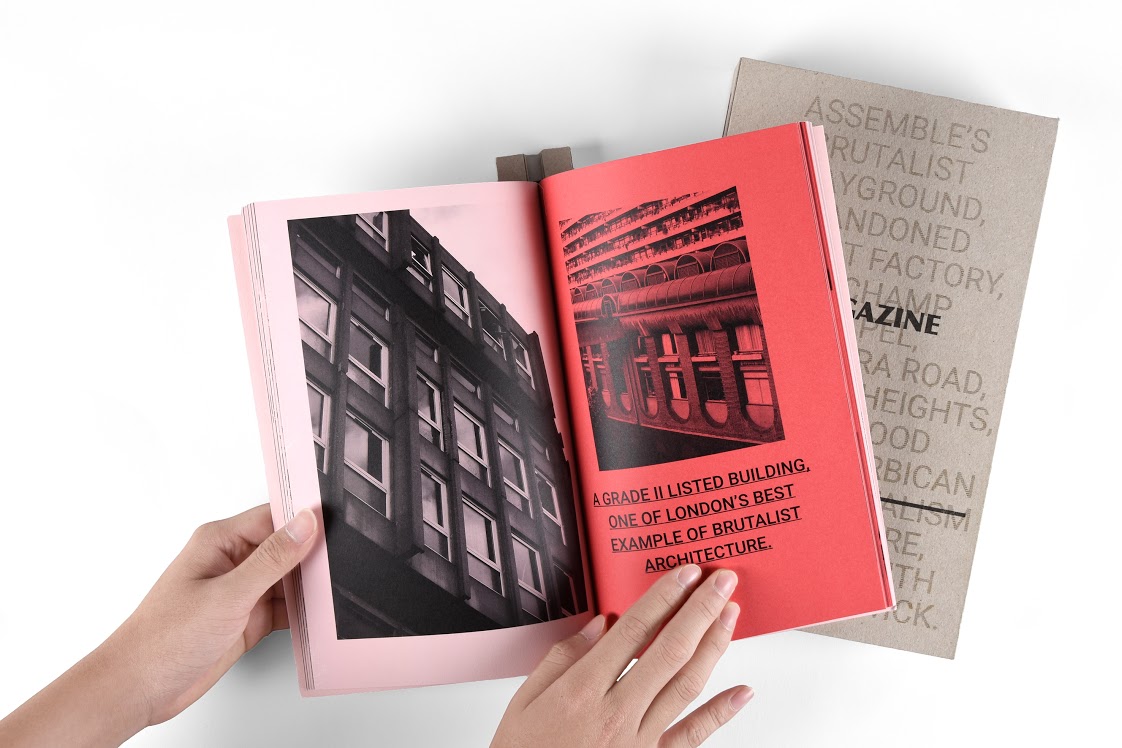
The magazine BRUT is a B5-formatted publication which presents icons of brutalist architecture around the globe. It comes in a 4 cm thick cardboard slipcase embellished with a Japanese stab stitch seam. When leafing through it, a striking element is the multiple use of the colour pink, which, with its feminine, friendly appearance, provides a counterbalance to the main subject matter: concrete.
Winner
(Magazine)
Macarius Eng
Diploma in Design Communication, Class of 2018
Entry: MATERIAL Magazine
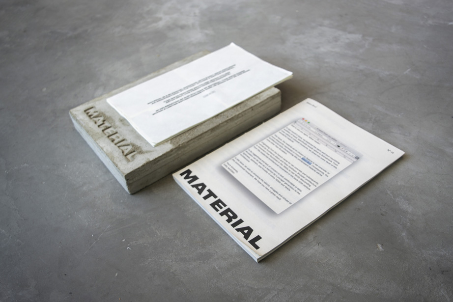
This issue of the bi-annual magazine MATERIAL features brutalist architecture. The design is modelled on the characteristics of this architectural style, which is reflected in the imperfectly casted raw concrete case, the raw paper stock as well as in the multi-faceted typography.
Winner
(Typographic Book)
Advanced Typography Class, led by lecturer Nadine Ouellet
Diploma in Design Communication, Class of 2018
Entry: Small and Ordinary
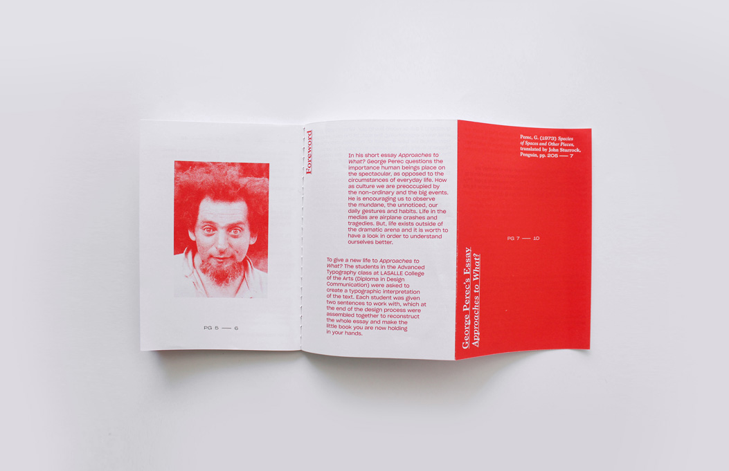
This work deals with the short essay “Approaches to What?” by George Perec. In his essay, the French author questions the importance human beings place on the spectacular and encourages the readers to observe the mundane, the unnoticed, their daily gestures and habits instead. Through graphic implementation, each double page of the typographic book brings a different part of the essay to life. Writing and imagery merge into vivid entities, matching the experimental character of the literary source.