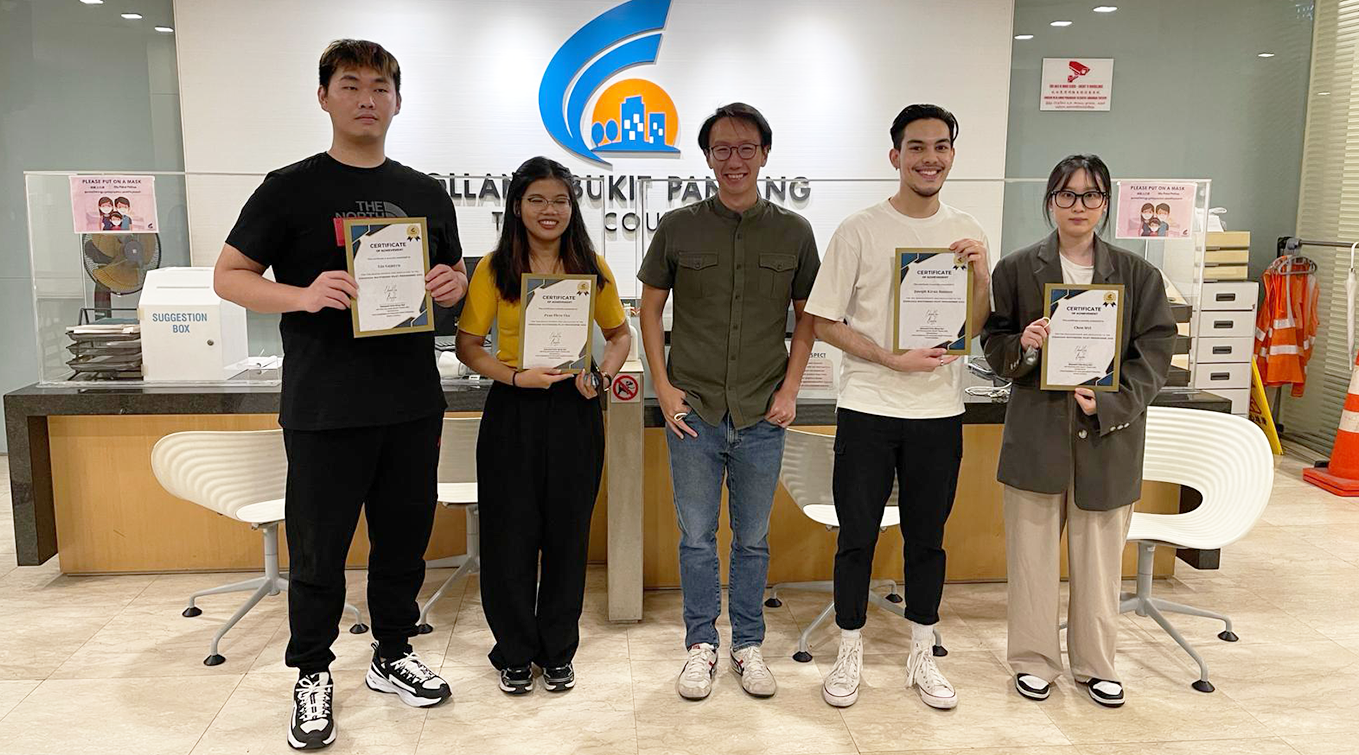
Member of Parliament Edward Chia (centre) with Diploma in Interior Design students (from left) Lin Guanyu, Pyae Phyo Thu, Joseph Kiran Hanson and Chen Siyi
Industry as classroom: Diploma in Interior Design’s Zhenghua wayfinding project
10 Oct 2024
When residents moved into the new BTO estates in the Zhenghua ward of Holland-Bukit Timah constituency, they noticed that they were experiencing difficulties navigating the HDB estates around the neighbourhood.
Parents and school children found it confusing to walk to West Spring Primary School, while existing residents in Senja estate faced similar problems when looking for amenities. These problems were exacerbated on wet weather days, when the only sheltered route entailed wayfinding through the void decks of interconnecting blocks.
LASALLE was then approached by Mr Edward Chia, Member of Parliament for Zhenghua, to explore how design might be able to make meaningful interventions to alleviate the residents’ frustrations. Diploma in Interior Design students thus embarked on a wayfinding project in collaboration with a team from the Holland-Bukit Panjang Town Council.
The project served both practical and aesthetic functions, aiming to improve the visibility of landmarks and nearby amenities at Segar Palmview and Senja estates, whilst also enlivening the spaces with visual art and design.
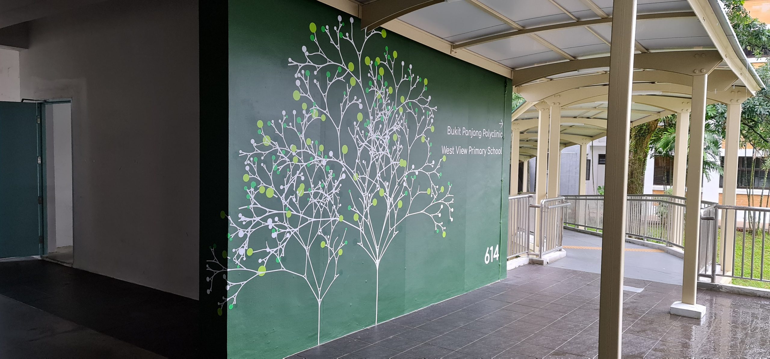
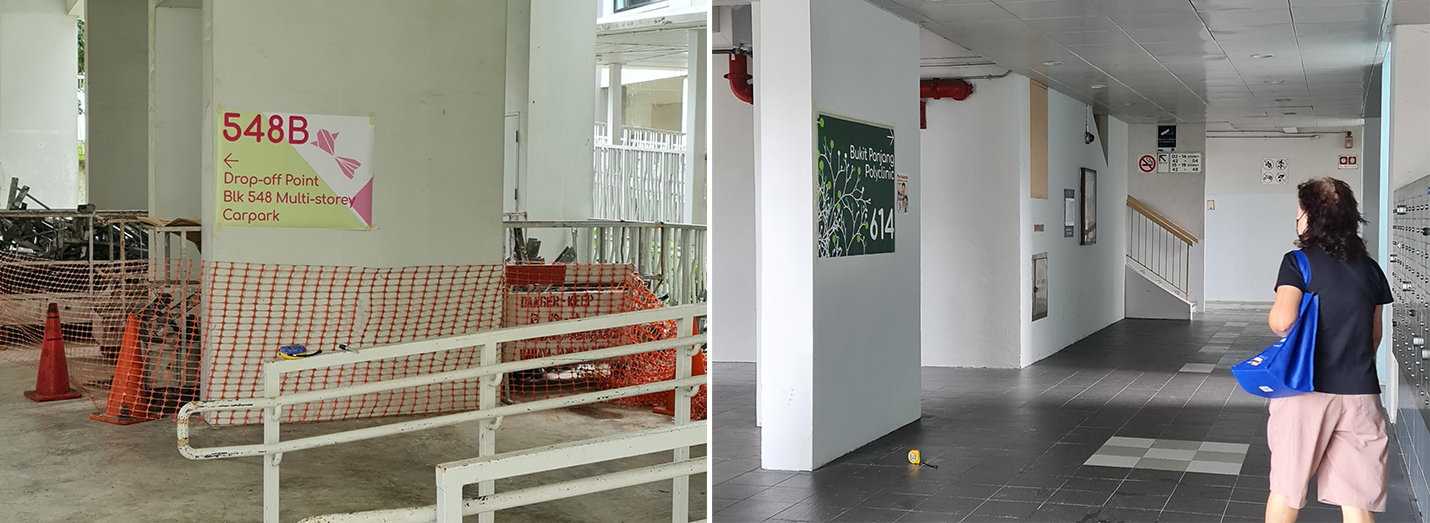
One of the wayfinding signs installed at Zhenghua.
Lecturer Eugene Lee shares insights into the project, including challenges faced, as well as how the team made decisions about design elements, taking functionality into consideration.
What were some challenges faced by the team during the course of the project?
The design team had to respond to various stakeholders’ concerns about the design elements, including the town council, residents and residents’ committee board. For example, the students were keen to create a composition that had a smaller font size, while the residents’ committee was concerned that this would impede readability.
To resolve this, we made a site visit where we put up test prints comprising several font sizes for all to consider and decide on a suitable size. This inclusive process fostered consensus-building and ensured that the designs catered to the diverse needs of the community and improved their living experience.
Test prints installed on site to ensure that stakeholders could come to an agreement on a suitable size.
How did the team balance art vs functionality?
Each decision was made by consciously questioning its aesthetics and functionality. One strategy was to use unique design icons that the majority of residents, whether young and old, could identify with. These included origami cranes and goldfish.
The fonts were deliberately selected for their friendly appearance and clarity, and the pleasant colour palette chosen for each design allows information to substantially stand out from the void deck background and be visible from afar, without becoming a visual eyesore and distraction.
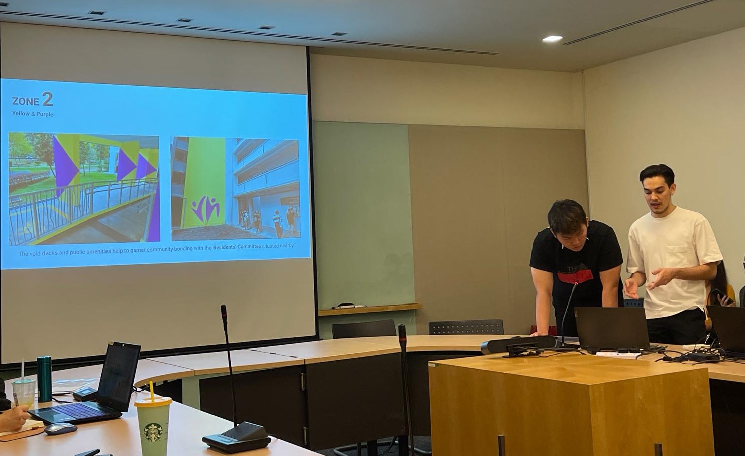
LASALLE students presenting their findings and proposals to the Holland-Bukit Timah Town Council team.
What are your thoughts on the final outcome?
We believe that we delivered a wayfinding design that is pleasant to encounter everyday and at the same time, clear for someone visiting the neighbourhood for the first time.
During installation, it was heartening to hear positive comments from residents—they were glad to see that the walls have been enlivened by art.
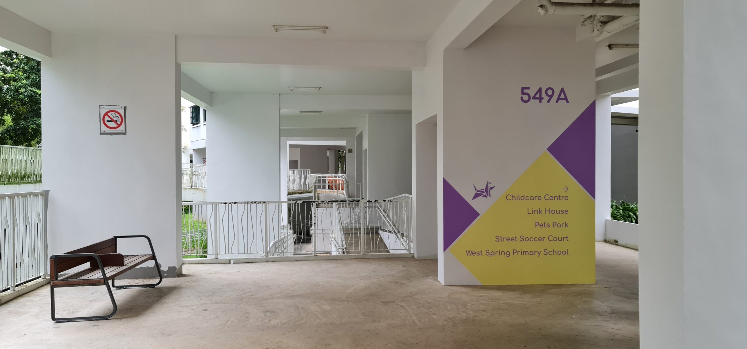
One of the wayfinding signs installed at Zhenghua.
Related stories
Trip report
Trip report: BA (Hons) Arts Management students explore Dublin on COIL Plus+
3 Jul 2026
By Amila Khairana My Year 2 classmates, Vera Tan and Stella Ong, and I travelled to Ireland in June 2026 to participate in a prestigious research symposium organised by the …
What happens after art school
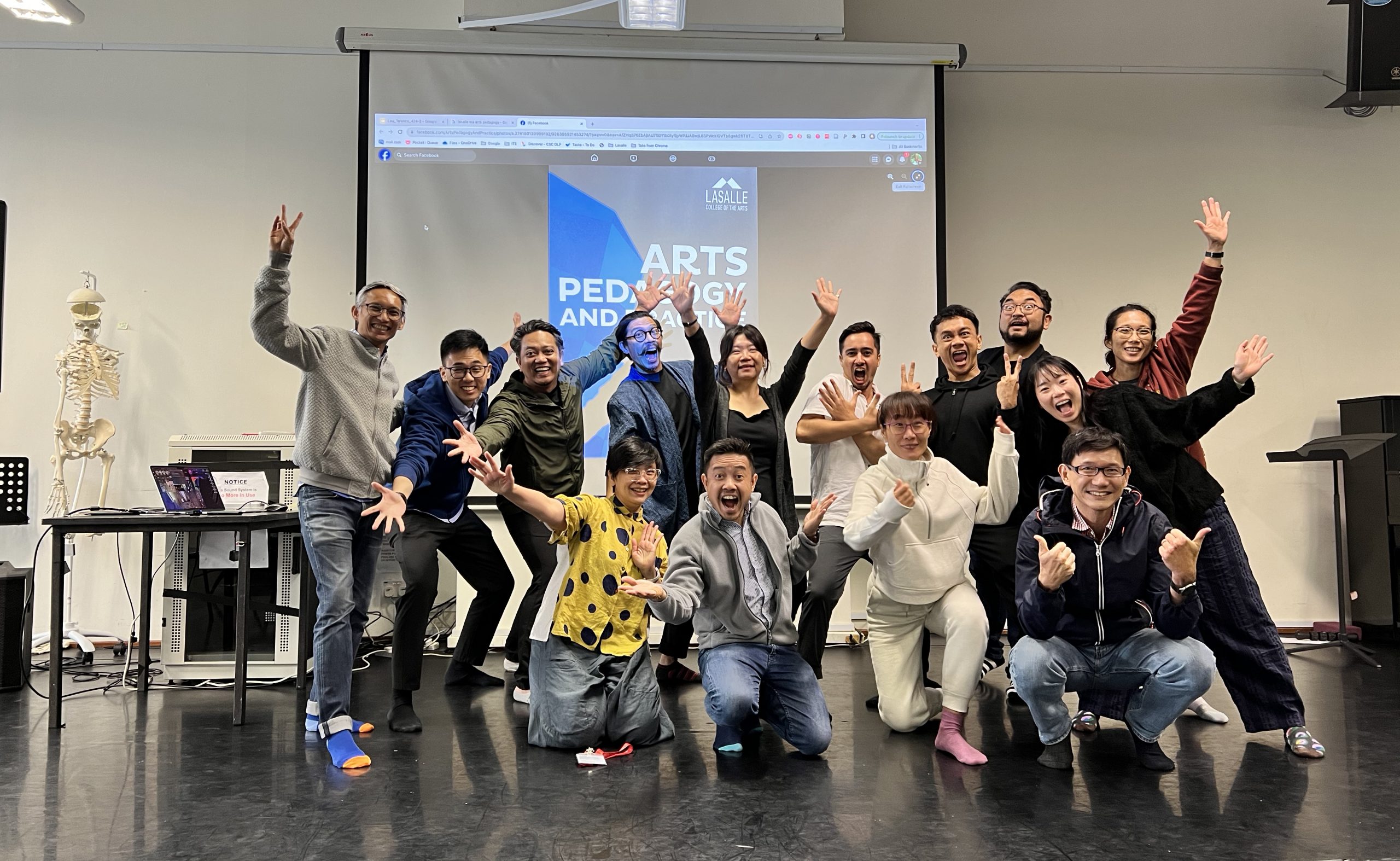
What happens after an MA: MA Arts Pedagogy and Practice alumni Yazid Jalil and Rafi Dean
29 Jan 2026
LASALLE’s MA Arts Pedagogy and Practice programme typically brings together practitioners and educators from a wide range of backgrounds. With unique opportunities for cross-pollination across disciplines, as well as an …
Industry as classroom
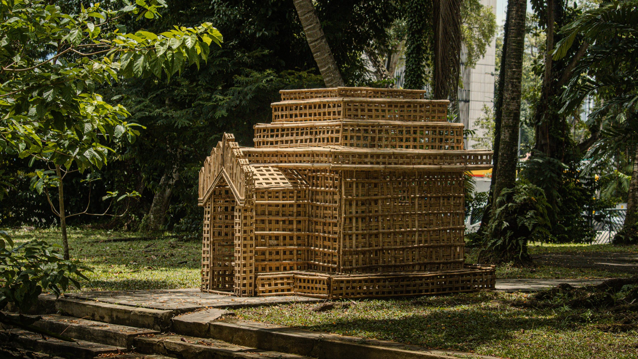
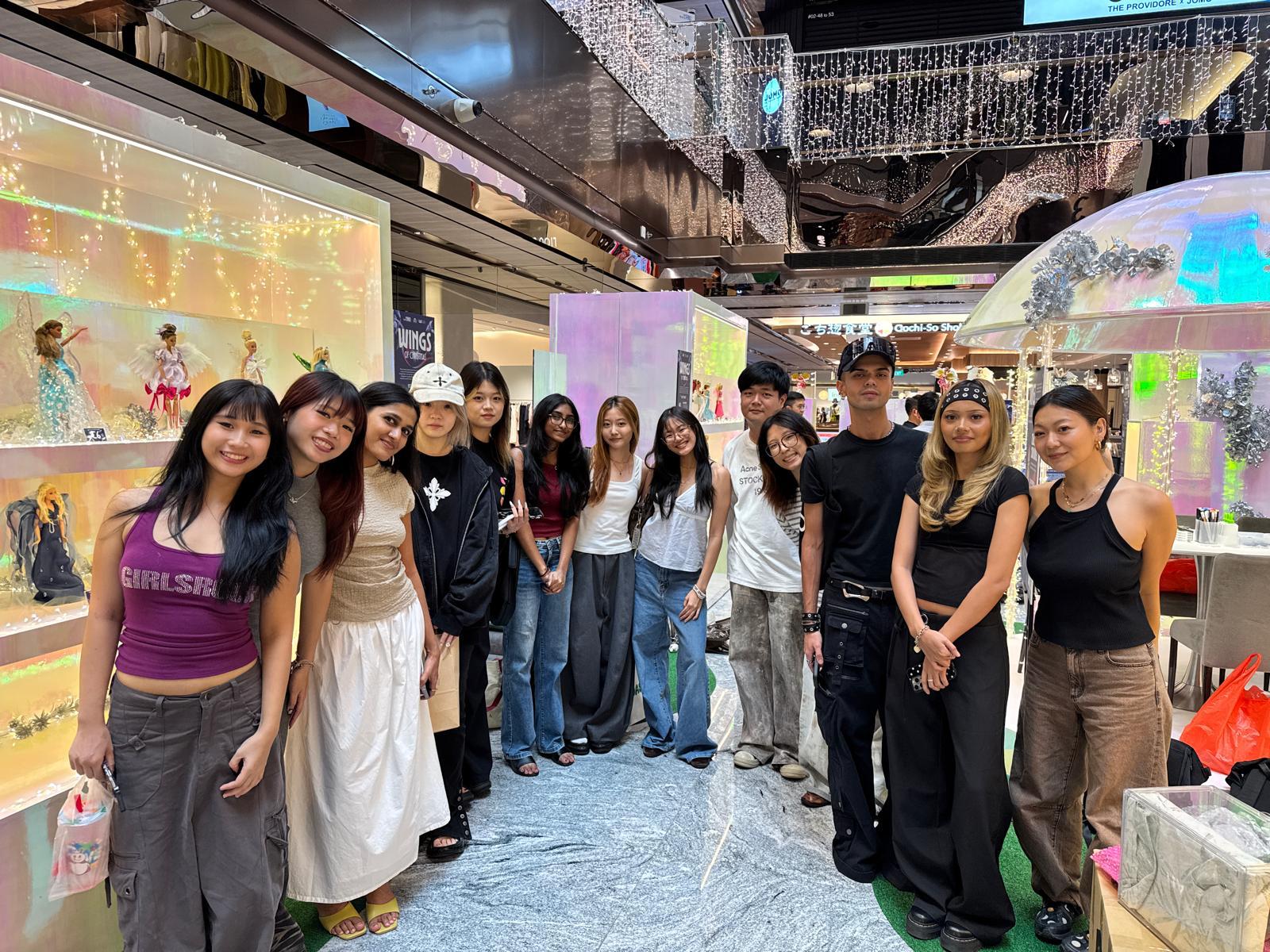
Fashion takes flight at Wisma Atria with LASALLE’s School of Fashion and Mattel Singapore
19 Dec 2025
30 Barbies collaboratively attired by 30 students from the BA (Hons) Fashion Design and Textiles and BA (Hons) Fashion Media and Industries programmes are currently on display at the indoor …
What to expect in LASALLE
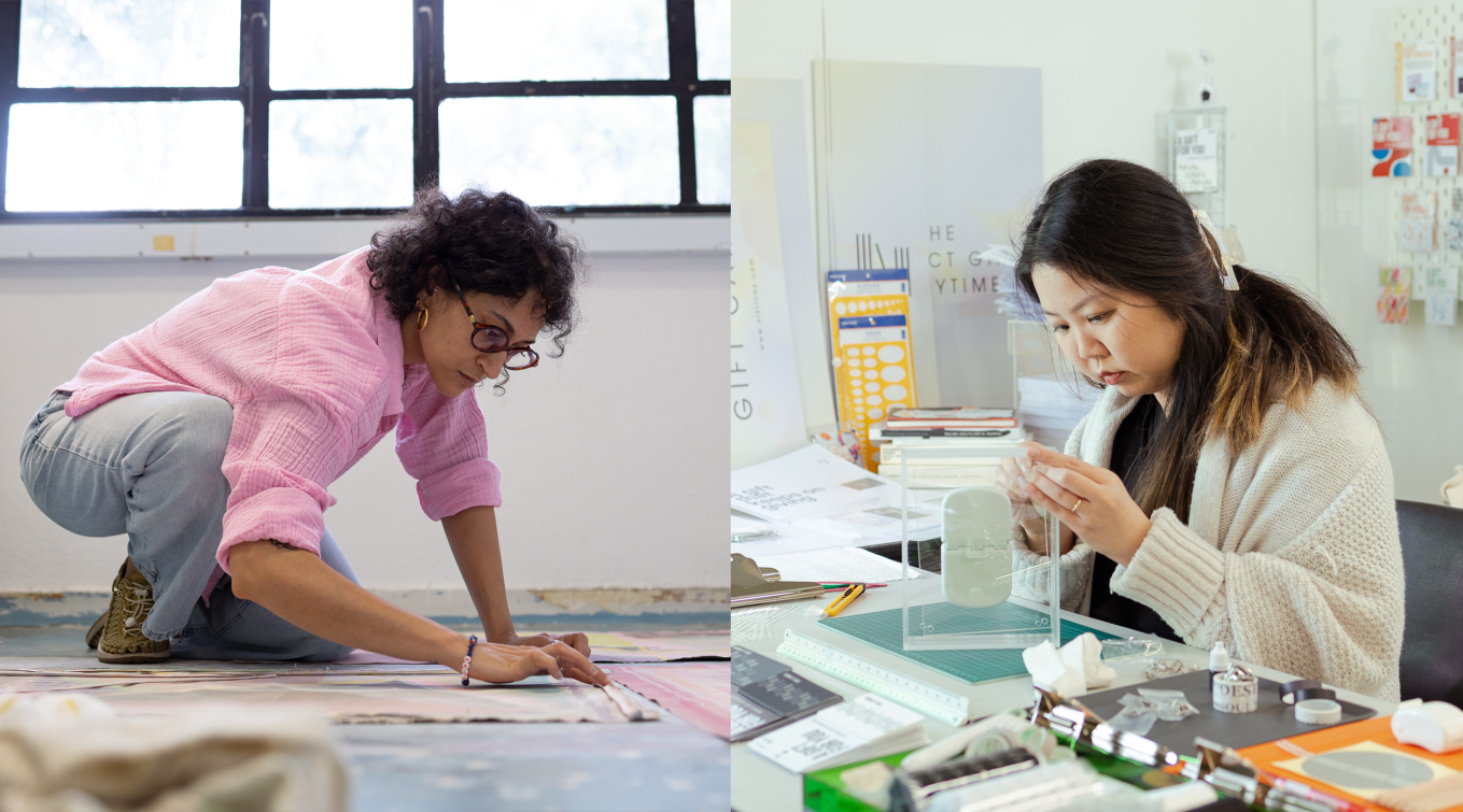
In the studio with: MA Fine Arts’ Nanaki Singh and Lim E-Lynn Joanne
29 Oct 2025
The artist’s studio is a space for individual experimentation and creation, but for Class of 2025 MA Fine Arts’ graduates Nanaki Singh and Lim E-Lynn Joanne, their studios were not …